- Serif
-
For other uses, see Serif (disambiguation).

Sans-serif font 
Serif font 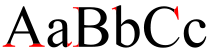
Serif font
(red serifs)In typography, serifs are semi-structural details on the ends of some of the strokes that make up letters and symbols. A typeface with serifs is called a serif typeface (or seriffed typeface). A typeface without serifs is called sans serif or sans-serif, from the French sans, meaning “without”. Some typography sources refer to sans-serif typefaces as "Grotesque" (in German "grotesk") or "Gothic", and serif typefaces as "Roman".
Serif fonts are widely used in traditional printed material such as books and newspapers. Many magazines employ sans serif typefaces, as some editors state that they are "cleaner", regardless of any impact on readability from the lack of serifs.[1] Numerous studies have been done on the readability of serif vs. sans serif typefaces. Studies indicate that serif typefaces may be more readable in print. Studies of on-screen use are more ambiguous, suggesting that low screen resolutions make serifs more difficult to discern, with a resulting erosion of readability compared to sans serif fonts.
Contents
Origins and etymology
 Roman brushed capitals.
Serifs are thought to have originated in the Roman alphabet with inscriptional lettering—words carved into stone in Roman antiquity. The explanation proposed by Father Edward Catich in his 1968 book The Origin of the Serif is now broadly but not universally accepted: the Roman letter outlines were first painted onto stone, and the stone carvers followed the brush marks which flared at stroke ends and corners, creating serifs. Another theory is that serifs were devised to neaten the ends of lines as they were chiseled into stone.[2] [3] [4]
The origin of the word serif is obscure, but apparently almost as recent as the type style. In The British Standard of the Capital Letters contained in the Roman Alphabet, forming a complete code of systematic rules for a mathematical construction and accurate formation of the same (1813) by William Hollins, it defined surripses, usually pronounced "surriphs", as "projections" which appear at the tops and bottoms of some letters, the O and Q excepted, at the beginning or end, and sometimes at each, of all." The standard also proposed that surripses may be derived from the Greek words συν (together) and ριψις (projection). In 1827, a Greek scholar, Julian Hibbert, printed with his own experimental uncial Greek types. He explained that unlike the types of Bodoni's Callimachus, which were "ornamented (or rather disfigured) by additions of what I believe type-founders call syrifs or cerefs." The oldest citations in the Oxford English Dictionary (OED) are 1841 for "sans serif", given as sans serif, and 1830 for "serif". The OED speculates that serif was a back-formation from sanserif. Webster's Third New International Dictionary traces serif to the Dutch noun schreef, meaning "line, stroke of the pen", related to the verb schrappen, "to delete, strike through". Schreef now also means "serif" in Dutch.
The OED's earliest citation for "grotesque" in this sense is 1875, giving stone-letter as a synonym. It would seem to mean "out of the ordinary" in this usage, as in art grotesque usually means "elaborately decorated". Other synonyms include "Doric" and "Gothic," commonly used for Japanese Gothic typefaces.
East Asian analogues
Main article: Ming (typeface)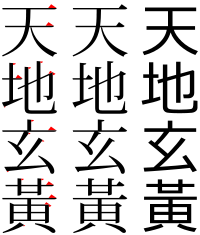 From left to right: a serif typeface with serifs in red, a serif typeface and a sans-serif typeface.
In the Chinese and Japanese writing systems, there are common type styles based on the regular script for Chinese characters akin to serif and sans serif fonts in the West. In China the most popular category of serifed-like typefaces for body text is called Song (宋体, Songti), in Japan the most popular serif style is called Minchō (明朝), and in Taiwan and Hong Kong it is called Ming (明體, Mingti). The names of these lettering styles come from the Song and Ming dynasties, when block printing flourished in China. Because the wood grain on printing blocks ran horizontally, it was fairly easy to carve horizontal lines with the grain. However, carving vertical or slanted patterns was difficult because those patterns intersect with the grain and break easily. This resulted in a typeface that has thin horizontal strokes and thick vertical strokes[citation needed]. To prevent wear and tear, the ending of horizontal strokes are also thickened[citation needed]. These design forces resulted in the current Song typeface characterized by thick vertical strokes contrasted with thin horizontal strokes, triangular ornaments at the end of single horizontal strokes, and overall geometrical regularity.
In Japanese typography, the equivalent of serifs on kanji and kana characters are called uroko—"fish scales." In Chinese, the serifs are called either youjiaoti (有脚体, lit. "forms with legs") or youchenxianti (有衬线体, lit. "forms with ornamental lines").
The other common East Asian style of type is called black (黑体/體, Heiti) in Chinese and Gothic (ゴシック体 Goshikku-tai) in Japanese. This group is characterized by lines of even thickness for each stroke, the equivalent of "sans serif." This style, first introduced on newspaper headlines, is commonly used on headings, websites, signs and billboards.
Readability and legibility
 Serifed text in a dictionary of French slang.
Serifed fonts are widely used for body text because they are considered easier to read than sans-serif fonts in print.[5] However, scientific study on this topic has been ambiguous. Colin Wheildon, who conducted scientific studies in 1982–1990, found that sans serif fonts created various difficulties for readers that impaired comprehension.[6] According to Kathleen Tinkel, studies suggest that "most sans serif typefaces may be slightly less legible than most serif faces, but ... the difference can be offset by careful setting".[7] Other studies have found no significant difference in readability for serif or sans serif.[8][9]
Serifed fonts are the overwhelming typeface choice for lengthy text printed in books, newspapers and magazines.[9] For such purposes sans-serif fonts are more acceptable in Europe than in North America, but still less common than serifed typefaces.[citation needed]
Sans-serif are considered to be legible on computer screens. According to Alex Poole,[8] "we should accept that most reasonably designed typefaces in mainstream use will be equally legible." A study suggested that serif fonts are more legible but are generally preferred less than sans serif fonts on screen.[10] Another study indicated that comprehension times for individual words are slightly faster when written in a sans serif font versus a serif font.[11]
Most web pages employ sans-serif type.[12] Hinting information, anti-aliasing, and subpixel rendering technologies have partially mitigated the perception of serif fonts on screen. Due to the basic constraint of screen resolution—typically 100 pixels per inch or less—the serifs in some fonts can be difficult to discern on screen. Some serif fonts, such as Georgia, are specially designed for web readability—employing higher x-heights in the letters as well as sturdier serifs.
As serifs originated in inscription they are generally not used in handwriting. A common exception is the printed capital I, where the addition of serifs distinguishes the character from lowercase L. Printed capital Js, and the numeral 1 are also often handwritten with serifs.
Classification
Serif fonts can be broadly classified into one of four subgroups: old style, transitional, modern and slab serif.
 The Adobe Garamond typeface, an example of an old-style serif
Old Style
Old style or humanist typefaces date back to 1465 and are characterized by a diagonal stress (the thinnest parts of letters are at an angle rather than at the top and bottom), subtle differences between thick and thin lines (low line contrast), and excellent readability. Old style typefaces are reminiscent of the humanist calligraphy from which their forms were derived. An old style font normally has a left-inclining curve axis with weight stress at about 8 and 2 o'clock; serifs are almost always bracketed; head serifs are often angled.[13]
Angled stressing of old style faces generates diagonal lock, which, when combined with their bracket serifs creates detailed, positive word-pictures (see bouma) for ease of reading. However, this theory is mostly contradicted by the parallel letterwise recognition model, which is widely accepted by cognitive psychologists who study reading.[citation needed]
Old style faces are sub-divided into Venetian (or humanist) and Garalde (or Aldine). Examples of Venetian old style typefaces include Adobe Jenson, Arno, Berkeley Old Style, Centaur, Cloister, Fairfield, Legacy, and Trinité. Examples of Garalde old style typefaces include Bembo, Caslon, Galliard, Garamond, Goudy Old Style, Granjon, Janson, Palatino, Renard, Sabon, and VandenKeere.
 The Times New Roman typeface, an example of a transitional serif
Transitional
Transitional or baroque serif typefaces first appeared in the mid-18th century. They are among the most common, including such widespread typefaces as Times New Roman (1932) and Baskerville (1757). They are in between modern and old style, thus the name "transitional." Differences between thick and thin lines are more pronounced than they are in old style, but they are still less dramatic than they are in modern serif fonts. Other transitional serifs include Bookman, Century, Georgia and Plantin.
 The Bodoni typeface, an example of a modern serif
Modern
Main article: DidoneModern or Didone serif typefaces, which first emerged in the late 18th century, are characterized by extreme contrast between thick and thin lines. Modern typefaces have a vertical stress, long and fine serifs, with minimal brackets. Serifs tend to be very thin and vertical lines are very heavy. Most modern fonts are less readable than transitional or old style serif typefaces. Common examples include Bodoni, Didot, Computer Modern, and Walbaum.
 The Rockwell typeface, an example of a slab serif
Slab serif
Main article: Slab serifSlab serif or Egyptian typefaces usually have little if any contrast between thick and thin lines. Serifs tend to be as thick as the vertical lines themselves and usually have no bracket. Slab serif fonts have a bold, rectangular appearance and sometimes have fixed widths, meaning that all characters occupy the same amount of horizontal space (as in a typewriter). They are sometimes described as sans-serif fonts with serifs because the underlying character shapes are often similar to sans-serif typefaces, with less variation between thin and thick shapes on the character. (A subcategory of slab serif is the Clarendon typefaces, which do have small but significant brackets, and structures more similar to seriffed typefaces.) Slab serif typefaces date to around 1800.
Examples of slab serif typefaces include Clarendon, Rockwell and Courier.
See also
- List of Serif typefaces
- Ming (typeface), a similar style in Asian typefaces.
- The analogs of serifs are called 鱗, literally "fish scales".
- Petit-serif
- San Serriffe, an elaborate typographic joke.
- Sans-serif
Notes
- ^ Wheildon, Colin (1995). Type and Layout: How Typography and Design Can Get your Message Across - Or Get in the Way. Berkeley: Strathmoor Press. p. 57. ISBN 0962489158.
- ^ Samara, Timothy (2004). Typography workbook: a real-world guide to using type in graphic design. Rockport Publishers. pp. 240. ISBN 9781592530816. http://books.google.com/books?id=denl7KWyM4EC&lpg=PA21&ots=D7LmOw3y1q&dq=origin%20of%20serif%20chisel&pg=PA21#v=onepage&q=%20chisel&f=false.
- ^ Goldberg, Rob (2000). Digital Typography: Practical Advice for Getting the Type You Want When You Want It. Windsor Professional Information. pp. 264. ISBN 9781893190054. http://books.google.com/books?id=uo1j1buy2qYC&lpg=PA173&dq=serif%20chisel&pg=PA173#v=onepage&q=serif%20chisel&f=false.
- ^ The Linotype Bulletin: 265. January–February 1921. http://books.google.com/books?id=Q4bnAAAAMAAJ&dq=serif%20chisel&pg=PA266-IA7#v=onepage&q=serif%20chisel&f=false. Retrieved 26 October 2011.
- ^ Merriam-Webster's Manual for Writers and Editors, (Springfield, 1998) p. 329
- ^ Wheildon, Colin (1995). Type and Layout: How Typography and Design Can Get your Message Across - Or Get in the Way. Berkeley: Strathmoor Press. p. 57, 59–60. ISBN 0962489158.
- ^ Kathleen Tinkel, "Taking it in: What makes type easy to read," adobe.com Accessed 28 December 2010. p. 3.
- ^ a b Literature Review Which Are More Legible: Serif or Sans Serif Typefaces? alexpoole.info
- ^ a b A Comparison of Two Computer Fonts: Serif versus Ornate Sans Serif
- ^ Effects of Font Type on the Legibility The Effects of Font Type and Size on the Legibility and Reading Time of Online Text by Older Adults. psychology.wichita.edu
- ^ Moret-Tatay, C., & Perea, M. (in press). Do serifs provide an advantage in the recognition of written words? Journal of Cognitive Psychology. valencia.edu
- ^ The Principles of Beautiful Web Design, (2007) p. 113
- ^ Old Style Serif, http://www.fonts.com/FavoriteFonts/OldStyleSerif.htm
References
- Robert Bringhurst, The Elements of Typographic Style (version 3.0), 2004, Hartley & Marks, Publishers, Vancouver, BC, Canada
- Father Edward Catich, The Origin of the Serif: Brush writing and Roman letters, 1991, Hartley & Marks, Publishers, Vancouver, BC, Canada
- Ellen Lupton, Thinking with Type: A Critical Guide for Designers, Writers, Editors, & Students, 2004, Princeton Architectural Press, New York
- James Mosley, The Nymph and the Grot: the revival of the sanserif letter, 1999, London: Friends of the St Bride Printing Library
External links
- "Serifs—What's the point?" discussion at Typophile on the role & function of serifs.
- "Who Shot the Serif?" and "The Return of the Serif" An introduction to the serif, and distinguishing between subtypes
- "Serif vs. Sans Serif", a discussion on Type Desk about serif versus sans serif type.
Typography terminology Page 
Paragraph Character Typeface anatomyCounter · Diacritics · Dingbat · Glyph · Initial · Kerning · Letter-spacing · Ligature · Subscript and superscript · Swash · Text figuresCapitalizationVertical aspectsClassifications Punctuation Typesetting Calligraphy · ETAOIN SHRDLU · Font (Computer font) · Font catalog · Letterpress · Lorem ipsum · Movable type · Pangram · Phototypesetting · Punchcutting · Type design · Typeface · Type foundry · MicrotypographyTypographic units Digital typography Categories:- Typography
- Serif typefaces


Wikimedia Foundation. 2010.