- Choropleth map
-
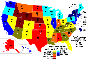 The US Presidential Election of 2004, visualised using a choropleth map
A choropleth map (Greek χώρος + πληθαίν:, ("area/region" + "multiply") is a thematic map in which areas are shaded or patterned in proportion to the measurement of the statistical variable being displayed on the map, such as population density or per-capita income.
The choropleth map provides an easy way to visualize how a measurement varies across a geographic area or it shows the level of variability within a region.
A special type of choropleth map is a prism map, a three-dimensional map in which a given region's height on the map is proportional to the statistical variable's value for that region.
Contents
Overview
The earliest known choropleth map was created in 1826 by Baron Pierre Charles Dupin.[1] The term "choroplethe map" was introduced 1938 by the geographer John Kirtland Wright in "Problems in Population Mapping".
Choropleth maps are based on statistical data aggregated over previously defined regions (e.g., counties), in contrast to area-class and isarithmic maps, in which region boundaries are defined by data patterns. Thus, where defined regions are important to a discussion, as in an election map divided by electoral regions, choropleths are preferred.
Where real-world patterns may not conform to the regions discussed, issues such as the ecological fallacy and the modifiable areal unit problem (MAUP) can lead to major misinterpretations, and other techniques are preferable.[2] Choropleth maps are frequently used in inappropriate applications due to the abundance of choropleth data and the ease of design using Geographic Information Systems.
 Incorrect (left) and correct application of a choropleth to the same data.
The dasymetric technique can be thought of as a compromise approach in many situations. Broadly speaking choropleths represent two types of data: Spatially Extensive or Spatially Intensive. Spatially Extensive data are things like populations. The population of the UK might be 60 million, but it would not be accurate to cut the UK into two halves of equal area and say that the population of each half of the UK is 30 million. Spatially Intensive data are things like rates, densities and proportions. These can be thought of conceptually as field data that is averaged over an area.
Another common error in choropleths is the use of raw data values to represent magnitude rather than normalized values to produce a map of densities.[3] This is problematic because the eye naturally integrates over areas of the same color, giving undue prominence to larger polygons of moderate magnitude and minimizing the significance of smaller polygons with high magnitudes. Compare the circled features in the maps at right.
Color progression
When mapping quantitative data, a specific color progression should be used to depict the data properly. There are several different types of color progressions used by cartographers. The following are described in detail in Robinson et al. (1995)[4]
 Single Hue Progression
Single-hue progressions fade from a dark shade of the chosen color to a very light or white shade of relatively the same hue. This is a common method used to map magnitude. The darkest hue represents the greatest number in the data set and the lightest shade representing the least number.
Two-variables may be shown through the use of two overprinted single color scales. The hues typically used are from red to white for the first data set and blue to white for the second, they are then overprinted to produce varying hues. These type of maps show the magnitude of the values in relation to each other.
 Bi-polar Color progression
Bi-polar progressions are normally used with two opposite hues to show a change in value from negative to positive or on either side of some either central tendency, such as the mean of the variable being mapped or other significant value like room temperature. For example a typical progression when mapping temperatures is from dark blue (for cold) to dark red (for hot) with white in the middle. When one extreme can be considered better than the other (like this map of life expectancy[5]) then it is common to denote the poor alternative with shades of red, and the good alternative with green.
Complementary hue progressions are a type of bi-polar progression. This can be done with any of the complementary colors and will fade from each of the darker end point hues into a gray shade representing the middle. An example would be using blue and yellow as the two end points.
 Blended Hue Color Progression
Blended hue progressions use related hues to blend together the two end point hues. This type of color progression is typically used to show elevation changes. For example from yellow through orange to brown.
 Partial Spectral Color Progression
Partial spectral hue progressions are used to map mixtures of two distinct sets of data. This type of hue progression will blend two adjacent opponent hues and show the magnitude of the mixing data classes. When the two colors chosen match the solar spectrum that shows the greatest magnitude.
 Full-spectral Color Progression
Full spectral progression contains hues from blue through red. This is common on relief maps and modern weather maps. This type of progression is not recommended under other circumstances because certain color connotations can confuse the map user.
 Value Progression
Value progression maps are monochromatic. Although any color may be used, the archetype is from black to white with intervening shades of gray that represent magnitude. According to Robinson et al (1995)[6]. this is the best way to portray a magnitude message to the map audience. It is clearly understood by the user and easy to produce in print.
Usability
When using any of these methods there are two important principles: first is that darker colors are perceived as being higher in magnitude and second is that while there are millions of color variations the human eye is limited to how many colors it can easily distinguish. Generally five to seven color categories is recommended. The map user should be able to easily identify the implied magnitude of the hue and match it with the legend.
Additional considerations include color blindness and various reproduction techniques. For example, the red–green bi-polar progression described in the section above is likely to cause problems for dicromats. A related issue is that color scales which rely primarily on hue with insufficient variation in saturation or intensity may be compromised if reproduced with a black and white device; if a map is legible in black and white, then a prospective user's perception of color is irrelevant.
Color can greatly enhance the communication between the cartographer and their audience but poor color choice can result in a map that is neither effective nor appealing to the map user; sometimes simpler is better.[7]
See also
- Cartograms are often colored as a choropleth.
- MacChoro
References
- ^ Michael Friendly (2008). "Milestones in the history of thematic cartography, statistical graphics, and data visualization".
- ^ T. Slocum, R. McMaster, F. Kessler, H. Howard (2009). Thematic Cartography and Geovisualization, Third Edn, pages 85-86. Pearson Prentice Hall: Upper Saddle River, NJ.
- ^ Mark Monmonier (1991). How to Lie with Maps. pp. 22-23. University of Chicago Press
- ^ Robinson, A.H., Morrison, J.L., Muehrke, P.C., Kimmerling, A.J. & Guptill, S.C. (1995) Elements of Cartography. (6th Edition), New York: Wiley.
- ^ Patricia Cohen (9 August 2011). "What Digital Maps Can Tell Us About the American Way". New York Times. http://artsbeat.blogs.nytimes.com/2011/08/09/what-digital-maps-can-tell-us-about-the-american-way.
- ^ Robinson et al. (1995), op. cit.
- ^ Light et al. (2004). "The End of the Rainbow? Color Schemes for Improved Data Graphics"". pp. 385. Eos,Vol. 85, No. 40, 5 October 2004.
Categories:- Map types
- Statistical charts and diagrams


Wikimedia Foundation. 2010.