- Logo
-
This article is about the graphic mark or emblem. For other uses, see Logo (disambiguation).
 Early trademark of the Chiswick Press
A logo is a graphic mark or emblem commonly used by commercial enterprises, organizations and even individuals to aid and promote instant public recognition. Logos are either purely graphic (symbols/icons) or are composed of the name of the organization (a logotype or wordmark).
In the days of hot metal typesetting, a logotype was a uniquely set and arranged typeface or colophon. At the level of mass communication and in common usage a company's logo is today often synonymous with its trademark or brand.[1]
Contents
History
Numerous inventions and techniques have contributed to the contemporary logo, including cylinder seals (c.2300 BCE), coins (c.600 BCE),[2][3] trans-cultural diffusion of logographic languages, coats of arms,[4] watermarks,[5] silver hallmarks and the development of printing technology.
As the industrial revolution converted western societies from agrarian to industrial in the 18th and 19th centuries, photography and lithography contributed to the boom of an advertising industry that integrated typography and imagery together on the page.[6] Simultaneously, typography itself was undergoing a revolution of form and expression that expanded beyond the modest, serif typefaces used in books, to bold, ornamental typefaces used on broadsheet posters.[7]
The arts were expanding in purpose—from expression and decoration of an artistic, storytelling nature, to a differentiation of brands and products that the growing middle classes were consuming. Consultancies and trades-groups in the commercial arts were growing and organizing; by 1890 the US had 700 lithographic printing firms employing more than 8,000 people.[8] Artistic credit tended to be assigned to the lithographic company, as opposed to the individual artists.
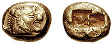 A coin from early 6th century BC Lydia bearing the head of a roaring lion with sun rays
Innovators in the visual arts and lithographic process—such as French printing firm Rouchon in the 1840s, Joseph Morse of New York in the 1850s, Frederick Walker of England in the 1870s, and Jules Chéret of France in the 1870s—developed an illustrative style that went beyond tonal, representational art to figurative imagery with sections of bright, flat colors.[8] Playful children’s books, authoritative newspapers, and conversational periodicals developed their own visual and editorial styles for unique, expanding audiences. As printing costs decreased, literacy rates increased, and visual styles changed, the Victorian decorative arts lead to an expansion of typographic styles and methods of representing businesses.[9]
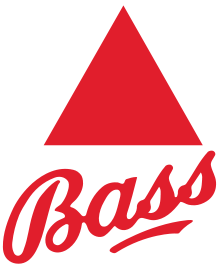 The First logo to be trademarked was the Bass red triangle in 1876
The Arts and Crafts Movement of late-19th century, partially in response to the excesses of Victorian typography, aimed to restore an honest sense of craftsmanship to the mass-produced goods of the era.[10] A renewal of interest in craftsmanship and quality also provided the artists and companies with a greater interest in credit, leading to the creation of unique logos and marks.
By the 1950s, Modernism had shed its roots as an avant-garde artistic movement in Europe to become an international, commercialized movement with adherents in the United States and elsewhere. The visual simplicity and conceptual clarity that were the hallmarks of Modernism as an artistic movement formed a powerful toolset for a new generation of graphic designers whose logos embodied Ludwig Mies van der Rohe’s dictum, "Less is more." Modernist-inspired logos proved successful in the era of mass visual communication ushered in by television, improvements in printing technology, and digital innovations.
Logos today
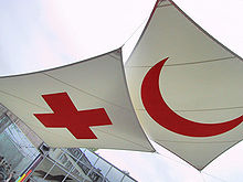 logos of the Red Cross and the Red Crescent
The current era of logo design began in the 1870s with the first abstract logo the Bass red triangle. Today there are many corporations, products, brands, services, agencies and other entities using an ideogram (sign, icon) or an emblem (symbol) or a combination of sign and emblem as a logo. As a result, only a few of the thousands of ideograms people see are recognized without a name. An effective logo may consist of both an ideogram and the company name (logotype) to emphasize the name over the graphic, and employ a unique design via the use of letters, colours, and additional graphic elements.
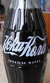 The Coca-Cola logo is identifiable in other languages, here written in Cyrillic.
Ideograms and symbols may be more effective than written names (logotypes), especially for logos translated into many alphabets in increasingly globalised markets. For instance, a name in the Arabic language would be of little help in most European markets. By contrast, ideograms keep the general proprietary nature of the product in both markets. In non-profit areas, the Red Cross (which goes by Red Crescent in Muslim countries) is an example of an extremely well known emblem which does not need an accompanying name. Branding aims to facilitate cross-language marketing. The Coca-Cola logo can be identified in any language because of its standard color and well known "ribbon wave" design.
Some countries have logos, e.g. Argentina, Spain, Italy, Turkey and The Islands of The Bahamas, that identify them in marketing their country solely for tourism purposes. Such logos often are used by countries whose tourism sector makes up a large portion of their economy.
Logo design
Logo design is an important area of graphic design, and one of the most difficult to perfect. The logo (ideogram), is the image embodying an organization. Because logos are meant to represent companies' brands or corporate identities and foster their immediate customer recognition, it is counterproductive to frequently redesign logos.
Color is considered important to brand recognition, but it should not be an integral component to the logo design, which could conflict with its functionality. Some colors are formed/associated with certain emotions that the designer wants to convey. For instance loud primary colors, such as red, are meant to attract the attention of drivers on highways are appropriate for companies that require such attention. In the United States red, white, and blue are often used in logos for companies that want to project patriotic feelings. Green is often associated with the health and hygiene sector, and light blue or silver is often used to reflect diet foods. For other brands, more subdued tones and lower saturation can communicate reliability, quality, relaxation, or other traits.
The logo design profession has substantially increased in numbers over the years since the rise of the Modernist movement in the United States in the 1950s.[11] Three designers are widely[12] considered the pioneers of that movement and of logo and corporate identity design: The first is Chermayeff & Geismar,[13] which is the firm responsible for a large number of iconic logos, such as Chase Bank (1964), Mobil Oil (1965), NBC (1984), PBS (1986), National Geographic(2003) and others. Due to the simplicity and boldness of their designs, many of their earlier logos are still in use today. The firm recently designed logos for the Library of Congress and the fashion brand Armani Exchange. Another pioneer of corporate identity design is Paul Rand,[14] who was one of the originators of the Swiss Style of graphic design. He designed many posters and corporate identities, including the logos for IBM, UPS, and ABC. Rand died in 1996. The third pioneer of corporate identity design is Saul Bass.[15] Bass was responsible for several recognizable logos in North America, including both the Bell Telephone logo (1969) and successor AT&T globe (1983). Other well-known designs were Continental Airlines (1968), Dixie (1969), and United Way (1972). Later, he would produce logos for a number of Japanese companies as well. He died in 1996.
Logo Design Process
Designing a good logo is not a simple task and requires a lot of involvement from the marketing team and the design agency (if outsourced). It requires clear idea about the concept and values of the brand as well as understanding of the consumer or target group as marketers call. Broad step in logo design process would be formulating concept, doing initial sketch, finalizing the logo concept, deciding the theme colors and format.
Psychy of Symbols
The effective design and use of a logo employs the understanding of human behavior. Whether cultural, or internal, people recognize and react to color, shapes, lines, fonts and other symbolic forms with emotions tied to their experiences.
Colors have a broad range of meaning according to different nations and cultures. A color could mean one thing in a particular setting, and something completely different in another.
Peoples minds have been trained to recognize the motion of a line. Horizontal lines often communicate a leveled security. Vertical lines convey dignity, and diagonal lines are full of energy, suggesting either rising or falling, or movement in one direction or another.
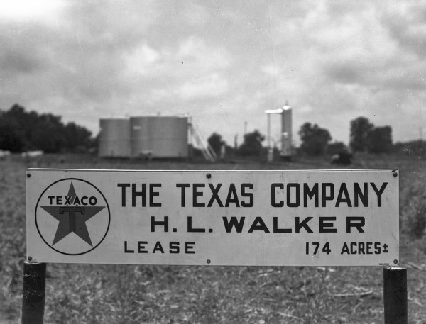
 Texaco logo
Dynamic logos
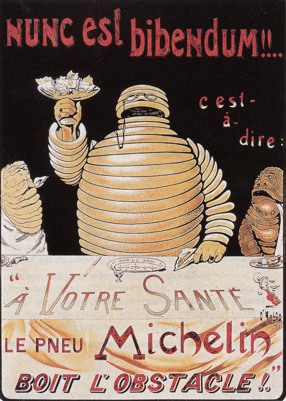
 Nunc est bibendum (now is the time to drink), 1898 poster of the Michelin.
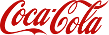 Coca-Cola logo
In 1898 the French tire manufacturer Michelin introduced the Michelin Man, a cartoon figure presented in many different contexts, such as eating, drinking and playing sports.
 The MTV logo.
By the early 21st century, large corporations such as MTV, Google, Morton Salt and Saks Fifth Avenue had adopted dynamic logos that change over time from setting to setting.[16]
Internet Compatible Logos
A company that use logotypes (wordmarks) may desire a logo that matches the firm's Internet Address. For short logotypes consisting of two or three characters, multiple companies are found to employ the same letters. A "CA" logo, for example, is used by the French Bank Credit Agricole, the Dutch Clothing Retailer C&A and the US Software Corporation CA Technologies, but only one can have the internet domain name CA.com.
In today's interface adaptive world, the use of a logo will be formatted and re-formatted from large monitors to small handheld devices. With the constant size change and re-formatting, logo designers are shifting to a more bold and simple approach, with heavy lines and shapes, and solid colors. This reduces the confusion when mingled with other logos in tight spaces and when stretched and squeezed between mediums.
Examples
Corporations, businesses and products
Due to the design, the color, the shape, and eventually additional elements of the logotype, each one can easily be differentiated from other logotypes. For example, a box of Kellogg's cereals will be easily recognized in a supermarket's shelf from a certain distance, due to its unique typography and distinctive red coloring. The same will be true when one is at the airport looking for the booth of the Hertz Rent-A-Car company.
Some well-known logos include Apple Inc.'s apple with a bite missing, which started out as a rainbow of color, and has been reduced to a single color without any loss of recognition. Coca-Cola's script is known worldwide, but is best associated with the color red; its main competitor, Pepsi has taken the color blue, although they have abandoned their script logo. IBM, also known as "Big Blue" has simplified their logo over the years, and their name. What started as International Business Machines is now just "IBM" and the color blue has been a signature in their unifying campaign as they have moved to become an IT services company.
There are some other logos that must be mentioned when evaluating what the mark means to the consumer. Automotive brands can be summed up simply with their corporate logo—from the Chevrolet "Bow Tie" mark to the roundel marks of Volkswagen, Mercedes-Benz and BMW, to the interlocking "RR" of Rolls-Royce—each has stood for a brand and clearly differentiated the product line.
Other logos that are recognized globally: the Nike "Swoosh" and the Adidas "Three stripes" are two well-known brands that are defined by their corporate logo. When Phil Knight started Nike, he was hoping to find a mark as recognizable as the Adidas stripes, which also provided reinforcement to the shoe. He hired a young student (Carolyn Davidson) to design his logo, paying her $35 for what has become one of the best known marks in the world (she was later compensated again by the company).[17]
Another logo of global renown is that of Playboy Enterprises. Playboy magazine claims it once received a letter at its Chicago, Illinois offices with its distinctive "bunny" logo as the only identifying mark, appearing where the mailing address normally appears.
Corporate identities are often developed by large firms who specialize in this type of work. However, Paul Rand is considered the father of corporate identity and his work has been seminal in launching this field. Some examples of his work were the UPS package with a string (replaced in March 2003), IBM and NeXT Computer.
An interesting case is the refinement of the FedEx logo, where the brand consultants convinced the company to shorten their corporate name and logo from "Federal Express" to the popular abbreviation "Fed Ex". Besides creating a shorter brand name, they reduced the amount of color used on vehicles (planes, trucks) and saved hundreds of thousands of dollars in paint costs. Also, the right-pointing arrow in the new logo hints at motion.
 Logo of Facebook Inc.
Starting about 4 years ago, certain companies, especially online technology companies, began to adopt a common look and feel. Many people refer to that standard as "web 2.0", but there is no official "web 2.0" standard. Web 2.0 logos often use small chunks of large type, with bright and cheery colors. Although there are literally hundreds of fonts used by web 2.0 companies, the logos are generally dominated by soft, rounded san serif fonts such as VAG Rounded (Crowdspring) and Helvetica Rounded (Skype). There are, however, numerous exceptions, as some web 2.0 companies have used classic fonts (Trade, News Gothic, Frutiger, Helvetica), while others have chosen to differentiate completely, using custom lettering like (Facebook).
Sports
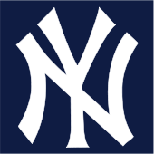 The Cap logo of the New York Yankees.See also: Baseball uniforms#Graphics and logos and Major League Baseball#MLB uniforms
Logos in subvertising
See also: Culture jamming and Guerrilla communicationThe most recognisable logos provide the brand's critics with the possibility of meme-hacking, a process also known as subvertising, turning the marketing message carried by the logo (either in its original form, or subtly altered) into a vehicle for an alternative message, frequently highly critical to the brand in question. An example is the AdBusters' corporate flag, a U.S. flag with the stars replaced by major corporate logos.
Virtually all distinctive design elements related to brands or logos can be subject to subvertising. Two groups known for subverting established logos and brands are ®™ark and AdBusters.
See also
- Icon
- Logo designers
- Logo extraction puzzles, games centered on the recognition of organizations or products based on their logo design elements
- Monogram, a motif made by overlapping or combining two or more letters or other graphemes to form one symbol
- Slogan
- Sound trademark
- Wikipedia:Logos
References
- ^ Wheeler, Alina. Designing Brand Identity ©2006 John Wiley & Sons, Inc. (page 4) ISBN 978-0-471-74684-3
- ^ Herodotus. Histories, I, 94.
- ^ A. Ramage, "Golden Sardis," King Croesus' Gold: Excavations at Sardis and the History of Gold Refining, edited by A. Ramage and P. Craddock, Harvard University Press, Cambridge, 2000, p. 18.
- ^ C. A. Stothard, Monumental Effigies of Great Britain (1817) pl. 2, illus. in Wagner, Anthony, Richmond Herald, Heraldry in England (Penguin, 1946), pl. I.
- ^ Meggs, Philip B. (1998). A History of Graphic Design (Third ed.). John Wiley & Sons, Inc.. p. 58. ISBN 978-0471291985.
- ^ Meggs, Philip B. (1998). A History of Graphic Design (Third ed.). John Wiley & Sons, Inc.. pp. 138–159. ISBN 978-0471291985.
- ^ Meggs, Philip B. (1998). A History of Graphic Design (Third ed.). John Wiley & Sons, Inc.. pp. 126–134. ISBN 978-0471291985.
- ^ a b Meggs, Philip B. (1998). A History of Graphic Design (Third ed.). John Wiley & Sons, Inc.. pp. 148–155. ISBN 978-0471291985.
- ^ Meggs, Philip B. (1998). A History of Graphic Design (Third ed.). John Wiley & Sons, Inc.. pp. 159–161. ISBN 978-0471291985.
- ^ Meggs, Philip B. (1998). A History of Graphic Design (Third ed.). John Wiley & Sons, Inc.. pp. 162–167. ISBN 978-0471291985.
- ^ Meggs, Philip B. (1998). A History of Graphic Design (Third ed.). John Wiley & Sons, Inc.. p. 363. ISBN 978-0471291985.
- ^ Meggs, Philip B. (1998). A History of Graphic Design (Third ed.). John Wiley & Sons, Inc.. pp. 369–374. ISBN 978-0471291985.
- ^ Meggs, Philip B. (1998). A History of Graphic Design (Third ed.). John Wiley & Sons, Inc.. pp. 373–4. ISBN 978-0471291985.
- ^ Meggs, Philip B. (1998). A History of Graphic Design (Third ed.). John Wiley & Sons, Inc.. p. 369. ISBN 978-0471291985.
- ^ Meggs, Philip B. (1998). A History of Graphic Design (Third ed.). John Wiley & Sons, Inc.. p. 375. ISBN 978-0471291985.
- ^ Rawsthorn, Alice (2007-02-11). "The new corporate logo: Dynamic and changeable are all the rage". International Herald Tribune. http://www.iht.com/bin/print.php?id=4548949. Retrieved 2008-05-21.
- ^ "Origin of the Swoosh". Nike, Inc.. Archived from the original on 2007-04-08. http://web.archive.org/web/20070408190641/http://www.nike.com/nikebiz/nikebiz.jhtml?page=5&item=origin. Retrieved 2007-04-13.
External links
- Logo at the Open Directory Project
Categories:


Wikimedia Foundation. 2010.